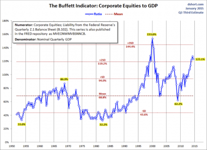
The higher financial markets rise, the harder they fall. By any objective measurement, the stock market is currently well into bubble territory.
Anyone should be able to see this – all you have to do is look at the charts. Sadly, most of us never seem to learn from history. Most of us want to believe that somehow “things are different this time”. Well, about the only thing that is different this time is that our economy is in far worse shapethan it was just prior to the last major financial crisis. That means that we are more vulnerable and will almost certainly endure even more damage this time around. It would be one thing if stocks were soaring because the U.S. economy as a whole was doing extremely well. But we all know that isn’t true. Instead, what we have been experiencing is clearly artificial market behavior that has nothing to do with economic reality. In other words, we are dealing with an irrational financial bubble, and all irrational financial bubbles eventually burst. And as I wrote about yesterday, the way that stocks have moved so far this year is eerily reminiscent of the way that stocks moved in early 2008. The warning signs are there – if you are willing to look at them.
The first chart that I want to share with you today comes from Doug Short. It is a chart that shows that the ratio of corporate equities (stocks) to GDP is the second highest that it has been since 1950. The only other time it has been higher was just before the dotcom bubble burst…

